Trueform Brand

Developing a set of guidelines for an electronic goods startup's look, voice & tone.

As a responsible design director, it’s one of my essential duties to provide design guidance for any company.

Working as the lone designer, I didn’t make an official branding guideline high on my list of deliverables. Just did the bare minimum to establish color, typography, and iconography. Trueform was a new startup when I joined and decided we could document it later. Along the way, I had several interns that asked me about the guidelines, but due to the frantic pace of getting our products out the door, I never had time to establish one.

During the summer of 2019, Jojo (UX Design intern) believed there was an opportunity to establish one. The pace of our business had become manageable. We carved out some time and worked on it together. With my guidance and an eager designer to identify trueform’s blind spots, it was a perfect opportunity for both of us to provide back to Trueform.


Our Goal

Establish clear brand guidelines for Trueform to help ensure a constant design language throughout all lines of business.


Our Hypothesis

These guidelines will galvanize our purpose, mission, and vision in one consistent tone for current and future contributors.

Date: Sept. 2017 - Dec. 2020
Duration: 1 month, 2 weeks. Revisions as needed.
Category: Branding
Project Type: Operational
Client: Apollo Robotics Technology
Website: trueform.io
Role: Design Director

Other Team Members
My Process

I allowed Jojo to be the lead once he shared his design strategy on how he would achieve the project goal. As his supervisor, I was curious to witness "how far" he could run with this opportunity. Jojo was always transparent with his project status, which allowed me to manage this project, his workload, as well as my companies expectation as I balance my workload.

This picture was from another project I was directing but you get the vibe.

Jojo working his magic with affinity mapping exercise

“This was both really exciting and really nerve-wracking. I was excited because I had the chance to help establish the design foundations for the company, I was nervous because I had never done this before.”

Jojo S., UX Design Intern; Trueform.io

As a project primer, we started with research and examined several brand guides to leverage what content it contained and how they presented it. We discussed and documented what we liked and disliked. I suggested Jojo pay attention to familiar patterns and what each of the companies is trying to communicate. Websites like brandingstyleguides.com provided us a rich, inspirational catalog.

Our Solution

Together, Jojo and I designed a 26-page brand book. The core elements consisted of typography guidelines, color palette, graphical elements, logo and wordmark treatment, and misuse.

Typography Page, Trueform Brand Guidelines

Back in 2017, I inherited the Montserrat font family when I first started. Stylistically it was similar to the original CEO's selection of Avenir. Unfortunately, the Avenir additional license prevented Truefrom from adopting it as a font selection when I started.

Now it was Summer 2019, we were using Acumin Pro (selected by a former VP per my recommendations), but it never felt right within our brand. I gave Jojo an opportunity with a fresh, young perspective. He prefers the font selection to be clean, readable, and feel modern. I pointed out it needs to have several font weights to accommodate all design scenarios.

Typography Weight, Trueform Brand Guidelines

Typography Style, Trueform Brand Guidelines

After reviewing Jojo's selections, we ended up with the old stand by of Proxima Nova. I initially used it back in 2007 as a young designer at PopCap Games. It was like putting on a favorite jacket in today's world. Though I've used it before and is quite popular with other brands, I decided it satisfied the need to move onto the next section.

Color Palette Page, Trueform Brand Guidelines

Establishing the color selects was one of the first design activities I completed during the first week of the job. The original palette has survived the various subjective opinions that have come through the company. However, I enjoyed the collaboration and process of what Jojo ended up with, so I passed it over to see what he could create. We discussed what we want Trueform color mood to be.

“We wanted colors to be bright and engaging, playful, but still professional.”

Jojo S., UX Design Intern; Trueform.io

Jojo transformed the original color palette to align with our newer, stated goals. The result was much more colorful, then it was before and settled into a state of bright, engaging, youthful, and clean color palette.

Monochromatic Gradient Page, Trueform Brand Guidelines

As a 2019 design trend, gradients align with our color goals. Jojo had a pleasant creative flow going. I suggested him to flesh out both monochromatic and multicolored gradient recommendations.

Multicolored Gradient Page, Trueform Brand Guidelines

Use the logo as a design, Trueform Brand Guidelines

During our guideline research, we noticed a design pattern of how brands utilized elements of their logo/wordmark to determine the precise spacing as it relates to its surroundings. Conditionally as a designer, I account for negative space in my designs. However, it was pleasing to see Jojo take it a step further to ensure the proper level of spacing was easily determined based on the element itself.

Logo Guidelines, Trueform Brand Guidelines

Wordmark Guidelines, Trueform Brand Guidelines
Use the logo as a design, Trueform Brand Guidelines

During my first days at Trueform, my first "ah-ha" moment was when I placed the golden ratio on top of the mark. The "tf" aligned perfectly. For a moment, I felt like Robert Langdon cracking the DaVinci code. Books like The Geometry of Design, by Kimberly Elam , provided a wealth of inspiration for us to create and wove it into Trueform's Brand Story.

Jojo and I experimented with the trueform logo. I suggested focusing on the icon and enlarged the size to see how it feels within a canvas. From a physical standpoint, there's promising negative space to exploit when extended off the page. During the process, we noted the few ways to do it correctly – justifying a page of improper usage.

Jojo enjoyed defining what not to do with his unusual combinations, as things became odd and awkward looking (in the right way).

Improper Usage, Trueform Brand Guidelines

“If Trueform was a person – The Style Guide would be how they dressed, the Voice and Tone Guide would be how they talked.”

Jojo S., UX Design Intern; Trueform.io

Naturally, we came into this as we completed the Branding Guidelines. I could tell Jojo's confidence was growing. I admired his passion and urged him to take ownership of Trueform's Voice & Tone guide.

Trueform has always been at the intersection of communicating with customers and product makers. Our strategy was to ensure it was casual and engaging with customers in an approachable, modern, tech startup style. However, striking a balance with companies in a partnering approach with humility.
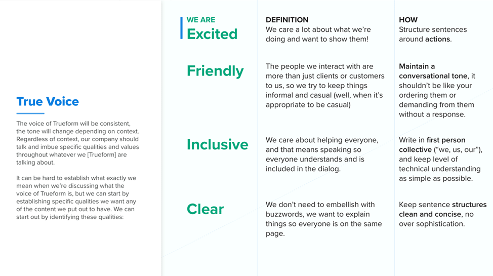
True Voice We Are, Trueform Brand Guidelines

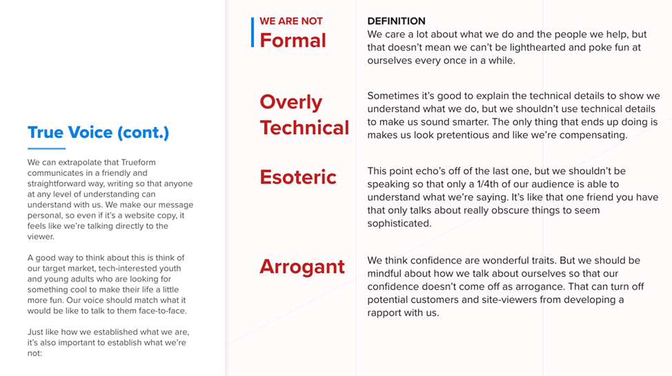
True Voice We're Not, Trueform Brand Guidelines

As Jojo's supervisor, I continued to guide him through the ambiguous creative process. Along the way, I shared the experiences that I've learned in my career and to trust the process I suggested. One of them was to remember to think of the end goal if he ever felt lost at any part of the process. The creative process, combined with technology and business feasibility, can get messy, but there is always a way for an innovative solution.

I suggested conducting meetings with the sales lead, the most tenured employee, and our current store manager to have a better understanding of how each of them communicated with the clients, team members, and customers. From my observations, Jojo was able to synthesize these conversations and establish a suitable B2B tone.

“The voice of a company is constant, but the tone is always changing. Your tone depending on the context of who and what you're talking about. However, the overall values you talk with stay constant.”

Jojo S., UX Design Intern; Trueform.io
True Tone, Trueform Brand Guidelines

Jojo's strategy was to ask each person how they felt Trueform embodied as a value. We were able to distill these notes into the core values of Trueform voice and tone. The tone itself had revealed itself naturally by asking – "What is the content? And "Who is the content for?". This simple framework established a fitting tone for all situations.

My Impression

The team was impressed with our presentation and appreciative of this document and our efforts. The brand guideline is a working Adobe XD file. My team will be on standby for any newly adopted pattern and document it into the document. The Voice and Tone guide is a word document that explains Jojo's thought process, and it's purpose.

My Learning
The summer 2019 design team – Jojo and Scottie

Jojo exceeded our expectations. Initially, I liked his upside as a videographer and saw his other qualities as necessities for our company. We were pleased we took a chance on this young professional. Here is Jojo's perspective on this project.

My favorite part of this project was the growth and confidence Jojo was able to earn daily (yes, it was that fast!). In general, Principles (of any kind) exist for a reason. Knowing the why's of it is a start, but it also comes to timing (when to provide guidance) and willingness to communicate transparently. Being a mentor gave me ownership, challenged my professional methodologies and, keeps me humble as a designer.

I'm continuing to evaluate and observe how other designers, contractors, vendors have applied the Trueform guidelines. I've given my critical feedback and recommendations on how to follow it. I've learned that I can't control everything or expect others to follow these guidelines. Until those teams are under my guidance, the Tureform Brand will be what it is. All I hope for is they have the tools to make it in this world.