Being two months on the job, I blindly trusted my colleagues with these requirements and sketched away. I leveraged the Material Guidelines as inspiration to lean on as well as engineering feasibility. The sketches below took about 2-3 days of aligning the business, engineering requirements and weaving it into the plans below.
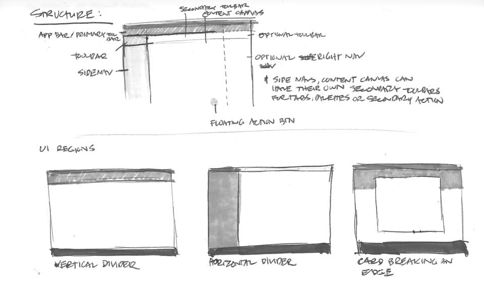
Determining regions within the brand portal.
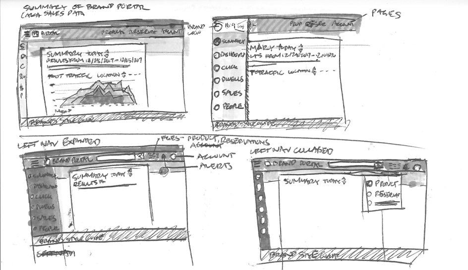
Early sketches of Sales Data and Summary Flow. Data was TBD, making it challenging to define the main section.
Comparing sketches of top nav bar features Vs. Dropdown Options Vs. Left Nav options.
Additional sketches of left nav interactions to accomodate the various sections.
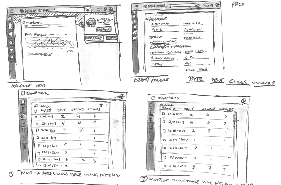
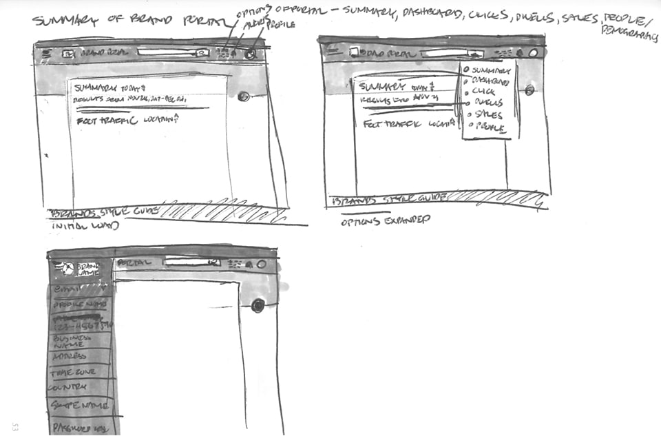
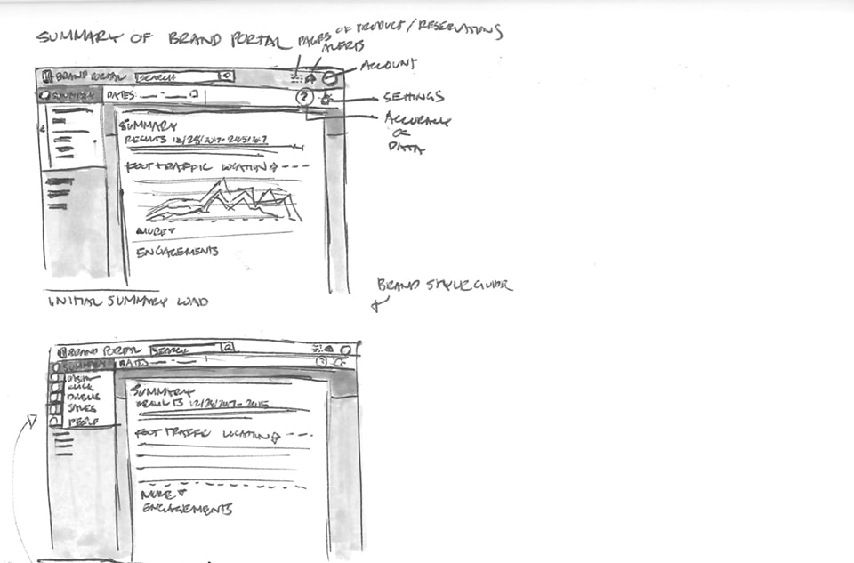
Sketches of account drop down, account details, click data table (which ends up being our MVP for the quantative data!).